Key Takeaways
- A free interactive tool that lets you drag or scroll through the entire Solar System from the Sun to the Kuiper Belt
- Every planet is rendered with real surface features — Jupiter's Great Red Spot, Saturn's Cassini Division, Earth's continents
- A speed-of-light animation shows you exactly how long sunlight takes to reach each planet
- Works on desktop and mobile — drag, swipe, use keyboard arrows, or let the auto-tour guide you
📑 Table of Contents
What We Built
We've just launched something we've been working on for a while: an Interactive Solar System Explorer that lets you drag your way from the Sun all the way out past Pluto and into the Kuiper Belt.
It's free, it runs in your browser, and it works on your phone. No app to download, no sign-up required.
The idea was simple. Most Solar System diagrams you see online are either static images that don't convey how vast the distances really are, or simplified cartoons where Neptune looks like it's a short walk from Mars. We wanted something that shows you the actual scale — and lets you feel it. Every planet is positioned at its real distance from the Sun using a logarithmic scale (because if we used a linear scale, you'd need a screen roughly 4 kilometres wide to fit everything in).
How to Use It
Getting around is intuitive. On desktop, click and drag left or right to scroll through the Solar System, or use your scroll wheel. On mobile, swipe. You can also use keyboard arrow keys, and there are zoom controls in the bottom toolbar if you want to zoom in on a particular region or zoom out to see the bigger picture.
A minimap in the corner shows you where you are in the full Solar System at all times — a tiny white rectangle marking your current viewport. And a live distance counter in the top-right updates as you scroll, showing your position in astronomical units (AU), kilometres, and light-travel time from the Sun.
Click or tap any planet and you'll get a popup with key facts: mass, diameter, distance, number of moons, orbital period, and a link through to our full guide page for that world.
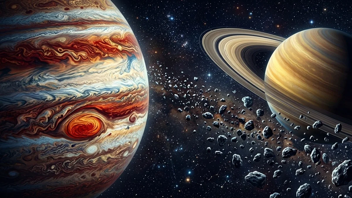
Every Planet, Rendered in Detail
This was the part we spent the most time on. Every planet in the explorer is drawn as a detailed SVG with its own surface features — not a generic coloured circle.
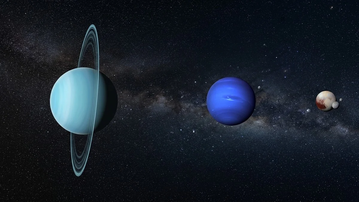
Mercury has craters. Venus has cloud bands. Earth has blue oceans, green-brown continents, and white cloud wisps. Mars shows terrain and its polar ice cap. Jupiter has horizontal cloud bands and the Great Red Spot. Saturn has a layered ring system with the Cassini Division visible and proper front-back ring rendering using clip paths. Uranus has its tilted orientation and faint ring. Neptune has its dark spot. Even the dwarf planets get attention: Pluto shows the heart-shaped Tombaugh Regio, Ceres has the bright Occator Crater spots, and Eris is rendered as a brilliant white ice ball.
The Sun is the centrepiece — a blazing golden orb with animated granulation and sunspot details.
Watch Light Cross the Solar System
This might be the most eye-opening feature. Hit the "Speed of Light" button and watch a golden photon leave the Sun and travel outward through the Solar System at 299,792 km/s — sped up 60× so you don't have to wait the real 5.5 hours it takes light to reach Pluto.
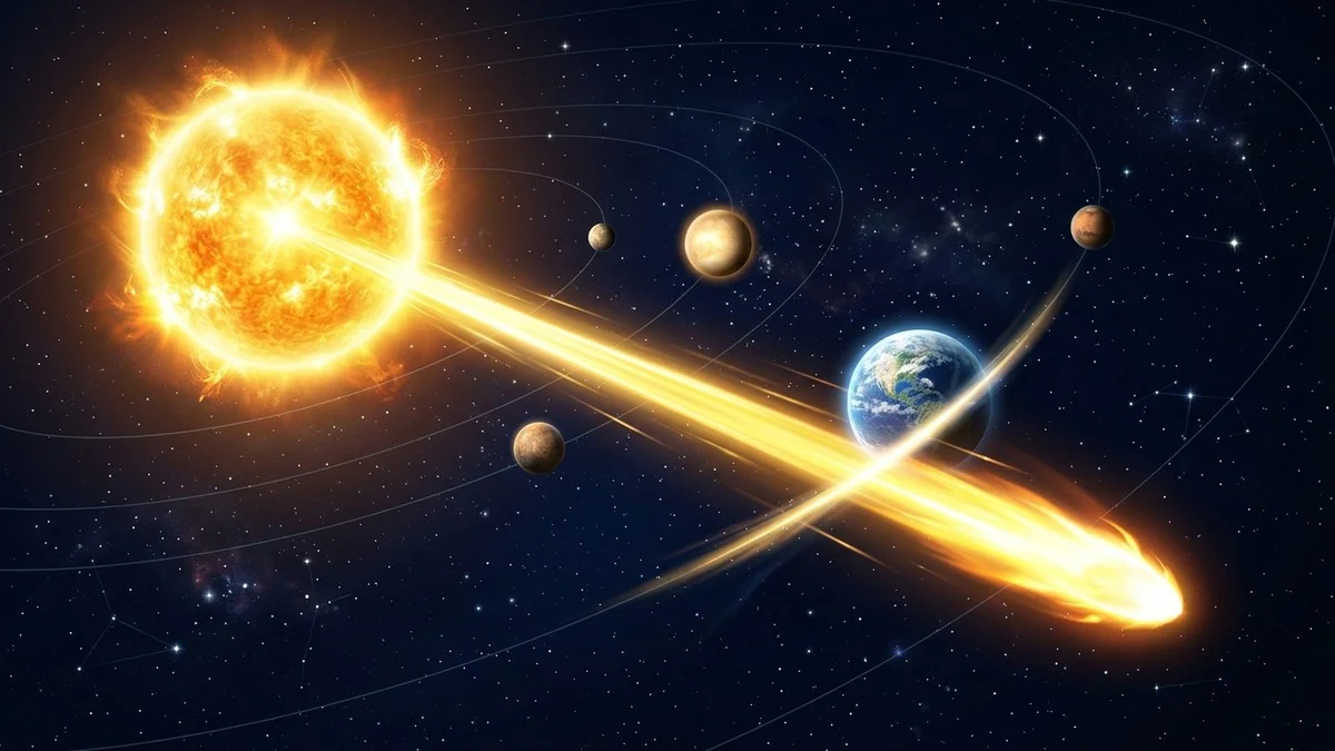
A heads-up display tracks the photon's journey in real time, showing how many minutes and seconds the light has been travelling. As the photon reaches each planet, a milestone notification appears: "Reached Earth — 8m 19s." It's one thing to know that sunlight takes about 8 minutes to reach Earth. It's another to watch a dot of light crawl past Mercury and Venus, realise it's been travelling for minutes, and it still hasn't reached us yet.
By the time the photon passes Neptune at 4 hours 10 minutes, you start to appreciate just how absurdly large the Solar System is — and why interstellar travel is such a colossal engineering problem.
Ready to see some of these planets for real?
Dragging Jupiter and Saturn around on screen is fun, but nothing beats spotting them for yourself. A decent pair of binoculars is the easiest way to bridge the gap between the explorer and the actual night sky.
Browse all our binocular reviews →
Affiliate disclosure: links to First Light Optics use our referral code. You pay the same price — we earn a small commission that helps keep WatchTheStars free.
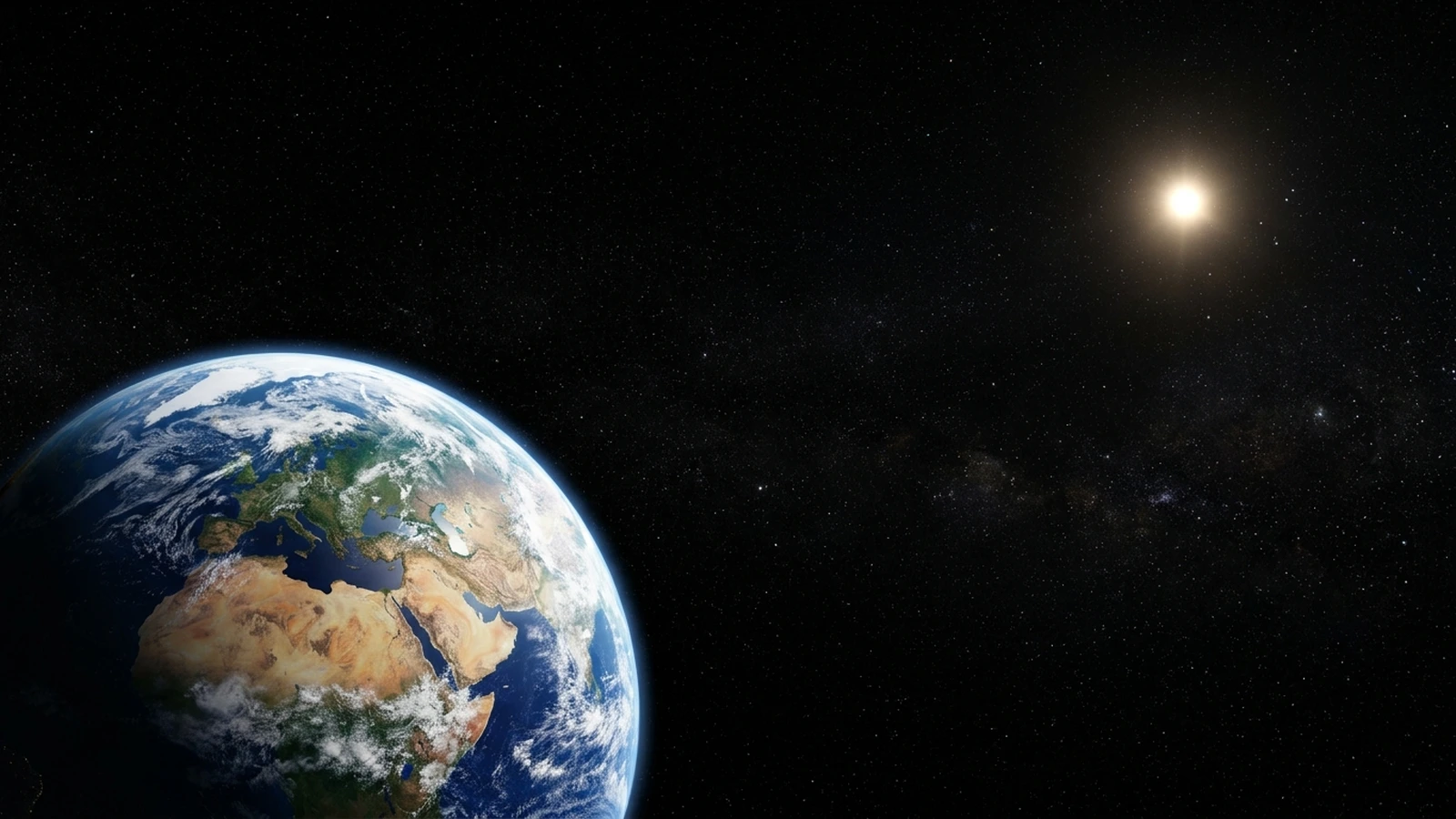
The Habitable Zone
A subtle green glow marks the Sun's habitable zone — the region where liquid water could theoretically exist on a planet's surface. It spans roughly 0.95 to 1.37 AU, and in the explorer you can see just how narrow that band is compared to the full extent of the Solar System. Earth sits comfortably inside it. Venus is just outside the inner edge. Mars grazes the outer boundary.
It's a good visual reminder of how fortunate Earth's orbital position is — and why so much exoplanet research focuses on finding worlds in this narrow sweet spot around other stars.
Asteroid Belt and Kuiper Belt
Between Mars and Jupiter, you'll see dozens of animated particles drifting through space — these represent the asteroid belt, concentrated between 2.1 and 3.3 AU. Further out, past Neptune, another field of particles marks the Kuiper Belt from 30 to 50 AU. These aren't just decoration. They give you a feel for where these regions actually sit in relation to the planets and how much empty space lies between them.
The Auto-Tour
If you'd rather sit back and watch, the auto-tour button (the rocket icon in the toolbar) will smoothly fly you from the Sun through every body in the Solar System, pausing at each one to show its name and a fun fact. It's a nice way to get an overview of the whole system without having to scroll manually — and the smooth cubic easing makes the journey feel cinematic.
The tour and the speed-of-light animation are mutually exclusive: starting one stops the other. And you can interrupt either at any time to take manual control.
Try It Now
The explorer is live right now at watchthestars.co.uk/solar-system/explore. It works on desktop, tablet, and mobile — no downloads, no sign-up. Just open it and start dragging.
If you've got kids who are learning about the Solar System, this is a great one to show them. Let them drag from planet to planet, tap each one to learn the facts, and watch the speed of light do its thing. It makes the distances click in a way that textbook diagrams can't.
We'd love to hear what you think. Found a bug? Got a feature idea? Drop us a message on Instagram or Facebook.